Make room for inspiration: design notes from the library.
A quieter search entry and clearer context for each style. How we shape the rhythm of discovery and reading.
Let the images speak first
A style library needs information, but it does not need to reveal everything at once. Search, use cases and filters sit above the images so you can find a direction before deciding how deeply to explore.
Detailed visual attributes live in an expandable filter area. Applied conditions remain visible and can be removed individually, keeping each refinement understandable.
Move from a thumbnail to the full story
Thumbnails help with quick comparisons. A full page offers room to look closely. A large preview, palette and style details lead into the reference prompt and related styles.
Similar styles use shared tags, visual attributes and purposes. Similar palettes use sampled image colors. These paths answer different questions: are you drawn to the expression or the combination of colors?
Give updates a place to be read
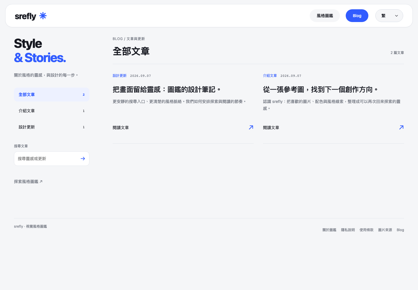
The NEWS separates introductions from design updates. On desktop, categories and search sit to the left of the articles. On mobile, categories become a horizontal row above a single reading column.
We carry over the library's blue accent, rounded shapes and clear type scale to connect browsing with reading. Future adjustments and the thinking behind them will also have a home here.
Need help installing or using SREFLY?Visit the support center →
Keep reading

Save the image, then add your Prompt and SREF
Start with an image you like. Keep its source, Prompt and style reference together so you can find them again when you create.
Organize your next project with collections and tags
Collections describe where an image will be used. Tags describe its qualities. Keep your inspiration library easy to find and organize with simple categories.